Furnishing with colours: a guide to the perfect match
The choice of a colour isn't – and should never be – random. Riccardo Falcinelli, one of the most successful visual designers and art directors in Italy, knows this well. In 2017 he wrote a book that has already become a classic: Cromorama. Come il colore ha cambiato il nostro sguardo, which looks at the importance of colour from antiquity to the present day, to understand how the collective consciousness of colour in our contemporary culture was created. Every colour has its own meaning: just think of the colour chosen each year by Pantone, like the vibrant and optimistic Living Coral of 2019 inspired by coral reefs, or Ultra Violet which in 2018 was synonymous with freedom. This concerns not just the world of figurative arts and film, but also everyday life. This is why when it comes to designing our home environments, knowing how to choose the right palette for walls and furniture is fundamental for achieving harmony and balance among all the parts.
In this article you can learn how to decorate with the right colours, letting yourself be inspired by creativity while also paying attention to some "general rules" that are always good to keep in mind to avoid making simple mistakes.
The colour wheel and colour schemes
Furnishing with colours is not just an art but an actual science based on colour theory. While this subject is rather rich and fascinating, for the moment we'll focus on just a few basic concepts. Each colour is positioned at a precise point on the colour wheel: this is generated by combining the three primary colours (red, blue, yellow) into secondary colours (i.e. orange, green and purple), which in turn give life to tertiary colours (all the others). The colours can then be differentiated by hue (a colour mixed with white) and shade (a colour mixed with black) or depending on their temperature, so warm colours, cool colours and neutral colours.
On this wheel, you can find a series of colour schemes consisting of colour combinations like:
-
Monochromic: a single colour in different hues and shades.
-
Analogous: colours next to each other on the colour wheel.
-
Complementary: colours across from each other on the colour wheel.
-
Triadic: three colours equidistant from each other on the colour wheel.
Furnishing with colours: what are the winning combinations?
"Colour is often an idea or an expectation. That is, certain colours become one with the objects that wear them to the point that it is difficult to see them otherwise", Falcinelli writes in Cromorama. Before decorating our indoor – or even outdoor – spaces with colours, we must think about creating harmony between the different elements that make them up, starting from the walls and then moving on to the flooring, the furniture and all the accessories. The furnishing should reflect the tastes and personality of those who live in the spaces, but the suggestion that always applies is to pay attention to balance and not use more than three different colours. So let's see some advice with creative inspiration.
Interplay of contrasts
Whether you're considering a single room or the whole house, here's a great suggestion: the further apart the colours are inside the wheel we've told you about, the greater the contrast. An example? Yellow with purple, black with white, red with green. The tip is to choose the main colour and then select the secondary colour on the colour wheel that goes with the shade furthest from the first. By playing with complementary colours you can create environments with great personality, suitable for those who want to be bold: obviously, this combination is perfect to combine specific elements, like walls or floors with some furniture. Or, you can paint a single wall – like the back one – with a strong colour and use the complementary colour for a sofa, especially if the room is long and narrow.
The secret is always not to overdo it, even if you want to try optical contrasts. In this case, you can paint the wall with two alternating colours instead of just one, creating vertical or horizontal stripes: this simple trick will add movement to the room, creating a unique, unusual environment, but extremely contemporary and refined. What colours should you choose? A single bright colour like pink, yellow or bright green that alternates with a neutral colour like white or grey. Obviously, the furniture chosen must also have the same shades, so as not to create an unpleasant visual effect. Also, pay attention to the spaces you're working with. Horizontal lines make the room look wider but lower, while vertical stripes make the ceiling seem higher.
Chiaroscuro for a timeless environment
Another option for playing with contrasts is alternating light and dark: for an elegant touch that never goes out of style black and white is always a good option, but for those who want to try something different, why not try different shades, maybe even two different intensities of the same colour? Like a sparkling bright pink with a soft pastel pink or a baby blue colour with a more intense version, suitable for a vintage living room or bathroom. Another tip is to try to choose furniture with a darker shade than the floor.
Warm colours and cool colours
Combine warm and cool colours to create original, absolutely modern environments: this is the secret. In fact, if you combine cosy, warm colours like yellow, red and orange with a cool colour scheme featuring blue, green and purple – which augment the spaces by giving them a calming touch – the room acquires a sense of stability and balance. For a chic, contemporary bedroom or living room, this is a perfect combination: the advice is therefore to choose a warm colour as the dominant shade, and then combine it with cool tones in the furnishings to balance it.
Furniture: monochrome and similar colours
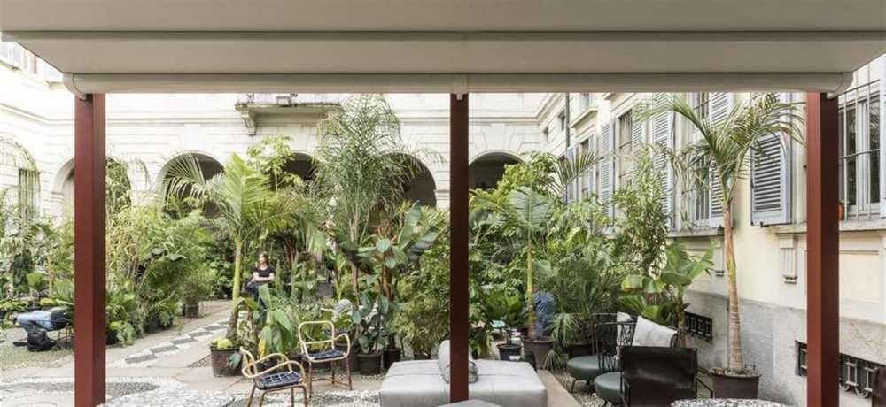
Now let's turn our attention to the furniture: how do you choose the most suitable colour combinations? There are many different possibilities, but two of them in particular are quite popular right now. The first is a monochrome look, selecting a single shade for the walls and using it also for the furnishings, playing with slightly different shades and hues. The other popular trend is to try to choose similar colours, that is, colours that match each other because they are adjacent on the colour wheel. An example? A pastel yellow wall blends perfectly with green furnishings. In this sense, even your outdoor space can be decorated with interesting colour combinations: for example, choosing a pergola of the same colour as the outside wall of the house will convey a feeling of harmonious continuity. Otherwise, for a more bold effect, you can opt for a contrasting colour.
As we have seen, colours offer a complex world of different emotions, feelings, atmospheres and vibrations. To find the right combination for your furnishings, both inside and outside your home, all you need to do is to experiment and let your creativity run free, because the possibilities are endless, just like Corradi Pergotenda® pergolas, which can be customised with any colour. What's your perfect combination?